Digital platforms have come a long way since custom-built PCs were the primary access point. Back then, powerful machines and stable connections enabled rich interactive experiences, but they were confined to desks. As mobile devices grew in capability, expectations changed.
Users no longer wanted responsiveness limited to one setting. They wanted seamless, real-time access in their pockets. Meeting this demand required more than shrinking desktop designs. It meant creating adaptive systems where the interface and backend could respond instantly to any device.
Case Study: Online Casinos
A clear example of this rethinking can be seen in online casinos, specifically blackjack platforms. These platforms faced a unique challenge: to recreate the dynamics of a live table in an online environment while making it accessible across devices.
The experience demanded live video streaming, interactive decision-making, and precise timing to mirror the authenticity of in-person play. A traditional desktop-only approach would have excluded the growing audience of mobile users, so innovation was not optional.
Their ability to adapt interfaces natively to different devices made these platforms stand out. On a smartphone, the design prioritises card visibility and intuitive gestures, while on a desktop, the interface can include more detailed statistics or multiple tables on one screen.
The backend systems also adapt in real time, ensuring smooth video playback and instantaneous updates regardless of whether the user connects on high-speed fibre or a patchy mobile network.
In doing so, casinos with live dealers and their platforms solved a complex gaming problem and set a benchmark for what modern interactive services could achieve. They proved that real-time interaction could be delivered consistently across any device with the right combination of interface design and backend resilience.
Mobile-Optimised UIs as a Default Expectation
The influence of mobile adoption has reshaped design priorities across industries. Today, mobile-optimised user interfaces are not secondary versions of desktop platforms but often the first and primary entry point. Designers anticipate that most users will engage through smartphones, and this expectation drives a mobile-first approach to layout, navigation, and functionality.
Mobile optimisation means more than responsive sizing. It involves anticipating touch interactions, ensuring buttons are large enough to tap comfortably, and structuring navigation so users can access core features within seconds. Typography must remain legible on compact screens, icons must be intuitive, and content must flow without excessive zooming or scrolling.
These design considerations reflect a broader cultural shift. Users equate platform quality with accessibility and ease of use. If a service performs poorly on mobile, its credibility is immediately diminished.
The lesson is that mobile design is no longer a constraint but a creative driver. Mobile-first design often produces cleaner, more focused experiences across all devices by simplifying interfaces and streamlining user journeys. The refinement demanded by mobile design usually improves desktop versions, creating consistency and coherence across platforms.
Backend Systems That Scale in Real Time
A sleek interface can only function effectively if the underlying backend is equally adaptive. Real-time interaction depends on backends that can scale instantaneously in response to fluctuating demand.
Modern architectures rely on distributed cloud computing, where workloads are balanced across servers that can expand or contract depending on demand. Real-time data processing pipelines ensure information flows quickly and minimises latency. For interactive platforms, even minor delays can disrupt engagement. A lagging video feed or a delayed update undermines the sense of immediacy that real-time systems promise.
These backends also incorporate redundancy to maintain uptime. If one server fails, another seamlessly takes its place, ensuring that users remain connected without interruption. The same methods that keep a virtual blackjack dealer’s video feed running smoothly are now applied to collaborative office tools, live sports streaming, and online education. Users may not see the backend intelligence at work, but their trust in a platform depends on its reliability.
The Convergence of Interaction Across Devices
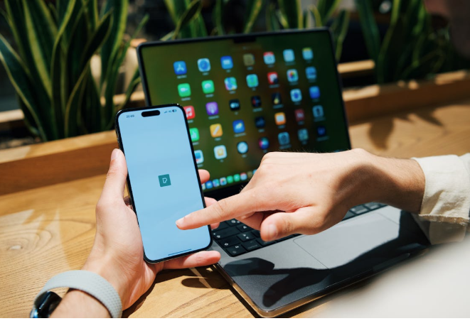
The most significant outcome of mobile optimisation and scalable backends is the convergence of experiences across devices. Users no longer think of access as device-specific. They expect to start an activity on one device and continue it on another without disruption. This continuity requires synchronisation of user states, data, and design elements across platforms.
Consider a professional who joins a video meeting from a desktop at work, continues the call on a tablet during a commute, and later checks the meeting notes on a phone at home. The transition feels seamless to the user, but behind the scenes, a complex orchestration of real-time updates ensures that the session remains uninterrupted. This model of cross-device continuity has become the standard for productivity tools, entertainment, education, and social networking.
Challenges and Future Directions
While remarkable progress has been made, scaling real-time interaction everywhere is challenging. Mobile devices differ widely in their capabilities, from high-end smartphones with advanced processors to budget models with limited resources.
Designing systems that deliver smooth experiences across this spectrum is a complex task. Connectivity also remains uneven, with users in some regions facing unreliable networks or high data costs. Battery life presents another constraint.
Continuous real-time interaction can drain devices quickly, whether through video streaming or constant data synchronisation. Developers must balance performance with efficiency, ensuring platforms remain usable without overwhelming hardware limitations.
Security and privacy are equally critical. As backends become more responsive and interconnected, they must guard against vulnerabilities that could compromise user data.
The future offers promising solutions. The rollout of 5G networks reduces latency and increases bandwidth, making real-time interaction more accessible in mobile contexts. Edge computing, which processes data closer to the user, further minimises delays. Artificial intelligence is poised to play a greater role in adaptive design, enabling systems to anticipate user needs and adjust interfaces accordingly.
These advances suggest that platforms maintain consistency across devices and tailor experiences to individual contexts in increasingly intelligent ways.
Conclusion
The journey from custom PC environments to mobile-first ecosystems underscores a fundamental shift in how technology is designed and experienced. By optimising for mobile access and scaling infrastructure intelligently, industries across the spectrum create seamless experiences that transcend devices. The result is a digital landscape where interaction is no longer tied to a desk but is available everywhere, instantly and reliably.